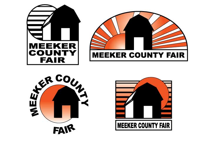
"Logo" is defined as a symbol or other design adopted by an organization to identify its products, uniform, vehicles, etc.
A professional design will: Be easily readable even when reduced, be recognizable even when reduced, be simple, tie all elements together or link them together strongly, and will grab the viewers' eye and lead the eye logically through all other elements.
A historical look at the evolution of logo design starts our discussion.
A Logo Quiz is done in class to illustrate how iconic logos can be.
Students are encouraged to read this pdf for more information. Another article about how logo design should reflect the product is here. Finally, a good article about how to inspire ideas for logo design can be found here.
For this project students will design two variations of a logo for themselves or a business. (Clarification: You are giving your Art Director two different designs for the same company/business.)
The logo must:
Evaluation:
4 points -- Professional presentation and Correctly followed bullet point instructions above.
3 points --Easily readable (including logical placement of elements)
3 points -- Eye Catching graphic representing yourself or the business
10 points total.


