
Students are to find 10 large images of magazine covers, save them on their computer, place them into a 10 page Indesign document with captions (under each image) explaining how at least two of the principles of design are used in each magazine cover. Export the document as a PDF (File>Export>Adobe PDF) titled with your name and turn it in.
Principles of Design include:
Instructions to find and save large images can be found here.
Evaluation:
1 point for each magazine cover with explanation
10 points total
A couple examples are shown below:
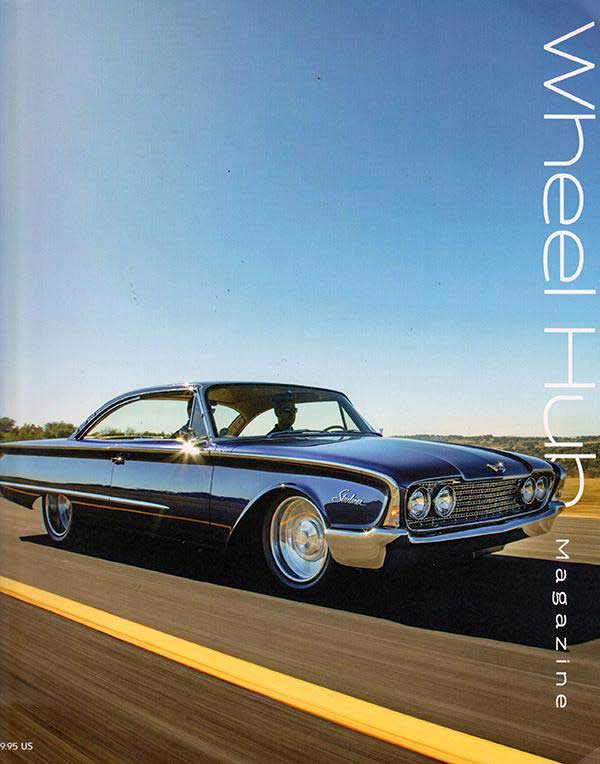
I can see the Principal of Unity in this cover because the color of the sky isrepeated in the side panels of the car. Color contrast is also used with the sharp yellow line contrasting with the blue of the sky and car.
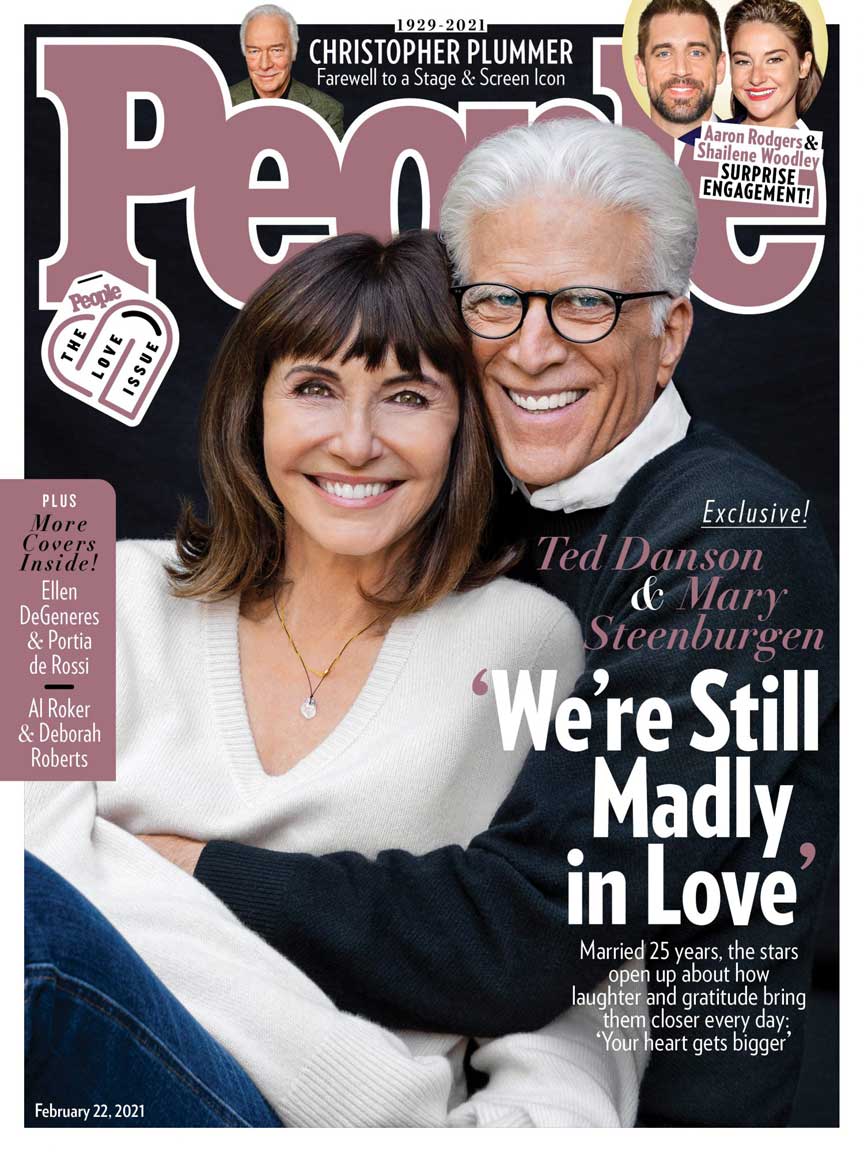
The principle of Unity is seen in the color of Ted Danson's hair, his wife's shirt, and the other white elements including text. Contrast is also seen in the dark background contrasting with the white elements.
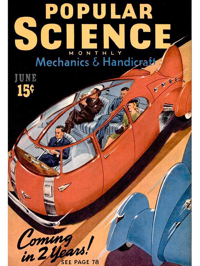
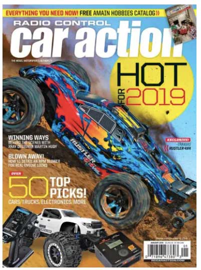
This cover uses the principal of Movement in the diagonal of the futuristic car. It also uses Contrast in the Orange and Blue (being opposites on the color wheel) and the bright windows contrasting with the dark black background.
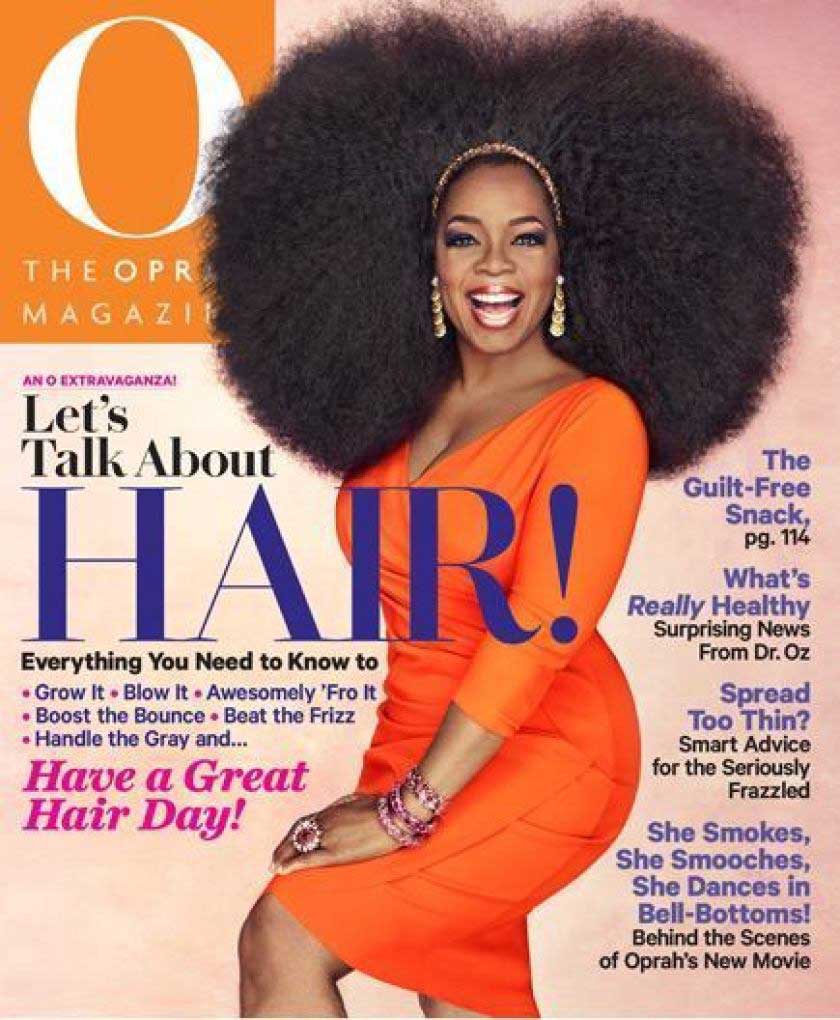
Below are some covers discussed in class: