Computer Graphics
Mr. Kulzer
Logo design: Simplification
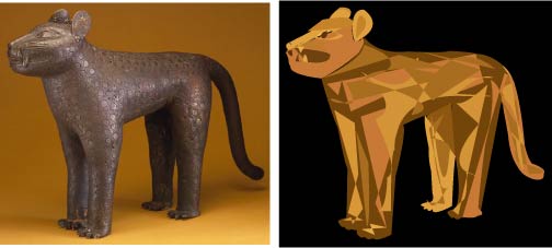
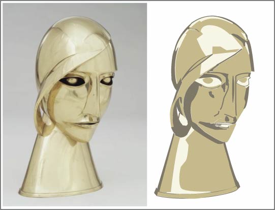
Students are shown examples of company logos that illustrate a simplification of a complicated object. The FTD logo is a perfect example. We discuss how logos are used and why it's important to be a simplified picture rather than one with alot of complicated detail.
Students are to choose a sculpture or 3-d object from the Artsconnected.org Website and simplify it (by redrawing it using Adobe Illustrator's Pen and other shape tools) so it could be used as a logo. No more than 3 colors should be used in their work if possible. The Artsconnected website is used because students can also learn about the artwork they choose.
Evaluation:
4 points -- PROFESSIONAL FINISHED PRODUCT (no stray points, etc.)
3 points -- READABLE/UNDERSTANDABLE WHEN REDUCED
3 points -- EFFECTIVELY CONVEYS THE INDIVIDUALITY OF THE ORIGINAL
10 points total.

