Art Fundamentals
 Mr. Kulzer
Grid Exercise Logo Duplication
A short lesson on logo design is presented to the class prior to doing this assignment. Some points covered include the use of
limited color pallet simplificationdynamics/movement
This will become the introduction to a logo design project in the future but for now we want students to be more aware of how logos are intentionally designed to instantly communicate a message to the viewer.
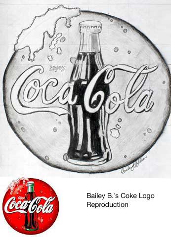
Students are to find a logo for a company that they enjoy and print it out. The logo must include at least two colors and have a sense of shading or three-dimensionality.
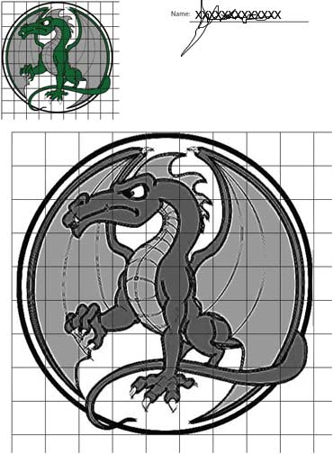
After printing the logo of their choice students grid it out with 1/4 inch or 1/2 inch squares, depending on how large the print is.
They then grid out their paper in larger squares so that the grid/logo will fill the paper when complete.
A sample page with gridded logo is available here. If students don't want to grid their own or can't find a suitable logo, they may simply use this example. Print it out, duplicate the logo, and hand it in.
Evaluation:
1 points -- Color indication through shading
3 points -- Neat light grid lines and correct use of grid to enlarge logo
3 points -- Accurate duplication of logo
3 points -- Use of time
10 points total.


 Mr. Kulzer
 Mr. Kulzer


